3 Tips for Making Your Marketing Materials Visually Engaging
For small businesses and seasoned marketing professionals alike, the battle for consumer attention is not easily won. Today, we will uncover the secrets behind crafting marketing materials that not only catch the eye but hold the gaze, delivering your message with unprecedented potency. Use our top tips to make your marketing materials more visually engaging.
Remember, Quality Is Essential
Low-quality marketing supplies don’t reflect well on brands. Not only do we mean low-quality designs, but also the marketing materials themselves—flyers, brochures, and business cards.
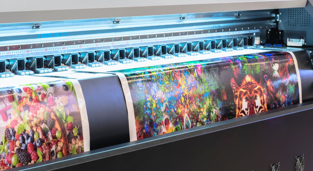
You don’t have much control over the device on which a customer views your marketing materials, but physical materials are different. This requires investing in high-quality paper and printing supplies to ensure a vibrant, eye-catching final result.
One of the most common applications for digital printing services is to customize marketing materials with professional-grade materials and processes. From the texture to the color, all physical items that display your brand should reflect your dedication to quality.
Find the Perfect Fit
Although you have no control over what devices your customers use, you can optimize your ad and logo designs for every online experience. With such a high volume of internet traffic originating from mobile devices, it’s mission-critical to make your visual content responsive and optimized for viewing on the small screen.
Your design should adapt without loss of quality or meaning, no matter what device your consumers use. A key reason to create a dedicated social media or marketing team is that you can bring experts in-house who create brand images that scale and who can optimize them for your chosen digital platforms. Whether it’s your website or an official social media account, you should have a flexible, fitting brand that catches the eye of anyone who scrolls by.
Maintain a Thread of Continuity
Each of our tips for making your marketing materials visually engaging has heavily focused on creating materials that, of course, look great. However, when it comes to branding, consistency is crucial when considering your company’s marketing strategy.
Consistency is the glue that holds your visual brand identity together. Whether it’s the placement of your logo, the use of color, or the style of photography, a cohesive approach tells a story of professionalism and completion in an engaging way.
Engagement goes beyond aesthetics; it’s about developing a visual language that resonates with your target audience. If your current marketing strategy lacks consistency, develop a style guide that encapsulates the essence of your brand. Your guide should translate the brand into visual elements such as colors and typography.
By mastering the art of visual engagement, you’re not just keeping pace with the competition; you’re leading the charge. Revise your existing marketing materials, create new ones with visual engagement at the core, and start a conversation with your audience that transcends spoken words.


